The Sales Summary report in Oolio One provides an overview of sales performance and trading patterns. Use the report to review sales trends, compare trading periods, analyse average order value and understand performance across different times and Locations.
The report also provides dedicated views for analysing a single trading day and comparing sales performance against forecasts and budgets.
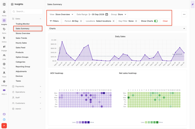
Open the Sales Summary report
- Open Back Office > Reports > Sales Summary.
- Select the required date range and Locations.
- Apply a day filter where required.
The information displayed in the report updates based on the selected filters.
Review sales trends:
-
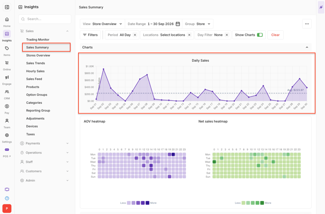
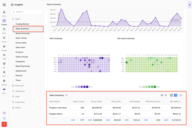
The Sales Trend chart displays daily sales across the selected period.
-
Use the chart to compare daily performance and see how sales compare with the average sales line.
Review sales heatmaps:
-
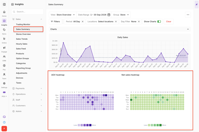
The AOV and Net Sales heatmaps provide a visual comparison of trading patterns across the selected period.
- AOV: Shows differences in average order value.
- Net Sales: Shows differences in Net Sales.
-
Heatmaps are available when the selected date range is greater than three days.
Review the Sales Summary grid:
-
The Sales Summary grid provides detailed sales information for the selected period.
-
Use the available grouping options to compare sales information across Locations, Sales Channels or other available groupings.
Understand Single Day View
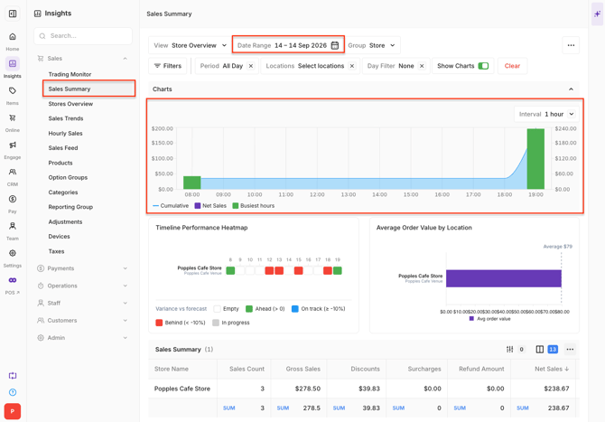
Select a single date in the date range picker to display Single Day View.
This view provides a more detailed breakdown of sales throughout the selected trading day.
-
The hourly bar chart displays Net Sales throughout the day.
- The two highest-performing hours are displayed in green.
- Remaining hours are displayed in purple.
- Non-trading periods are excluded.
-
A cumulative area chart is displayed using the secondary Y-axis to show how sales build throughout the day.
-
Use the interval selector to switch between:
- 15-minute
- 1-hour
-
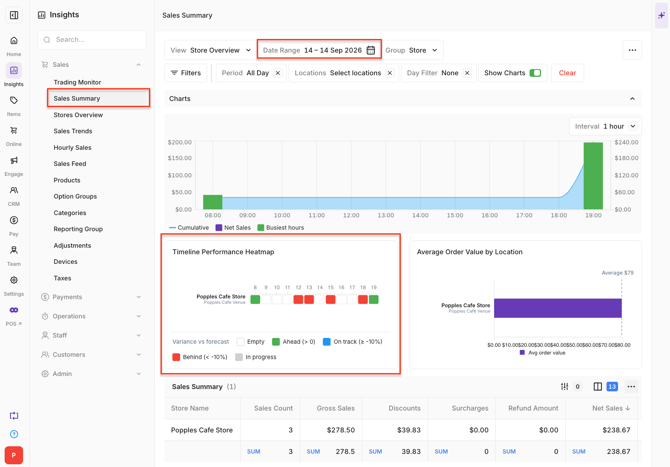
The Timeline Performance Heatmap displays one row for each Location, with hourly performance compared against forecast data.
-
The colours indicate the variance against forecast:
- Green: Within ±10% of forecast.
- Amber: Between ±10% and ±25% variance.
- Red: Greater than ±25% variance.
- Grey: The hour is incomplete.
Note: Timeline Performance requires forecast data to be configured.
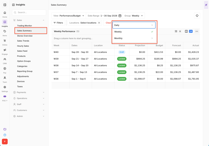
Review Performance / Budget
Change the report view to Performance / Budget to compare performance for the selected date range and Locations.
-
The information can be grouped by:
- Daily
- Weekly
- Monthly