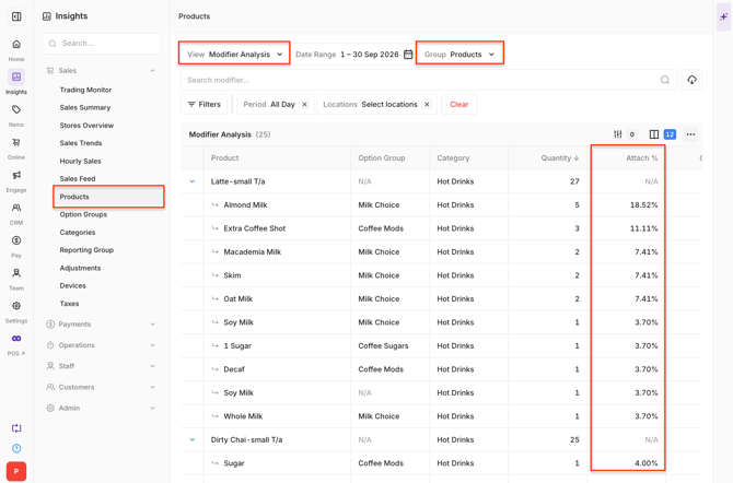
The Product Report in Oolio One provides three views for analysing Product sales, profitability and Modifier performance: Product Performance, Menu Engineering and Modifier Analysis.
Use the report to identify Products contributing to sales, compare performance over time, review profitability and understand which Modifiers are commonly selected.
Open the Product Report
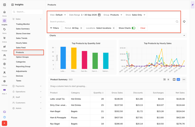
- Open Back Office > Insights > Product Report.
- Select the required date range and Locations.
- Use the view selector to choose Product Performance, Menu Engineering or Modifier Analysis.
The selected date range and Location filters remain applied when switching between views.
Understand Product Performance
Select Product Performance to review Product sales and compare performance with the selected comparison period.
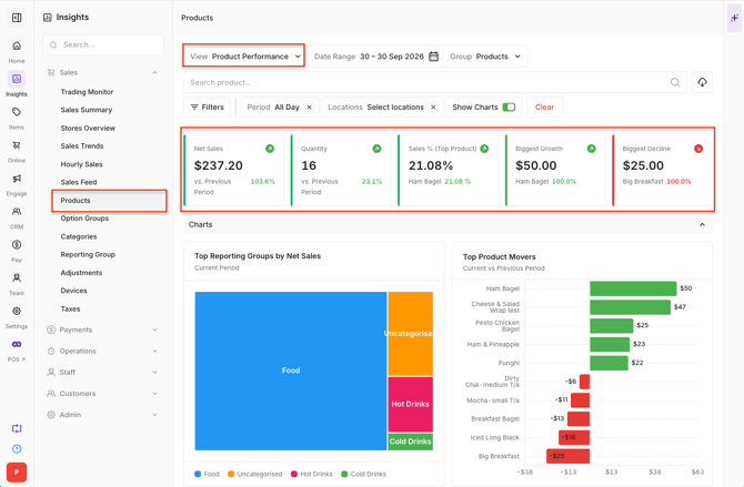
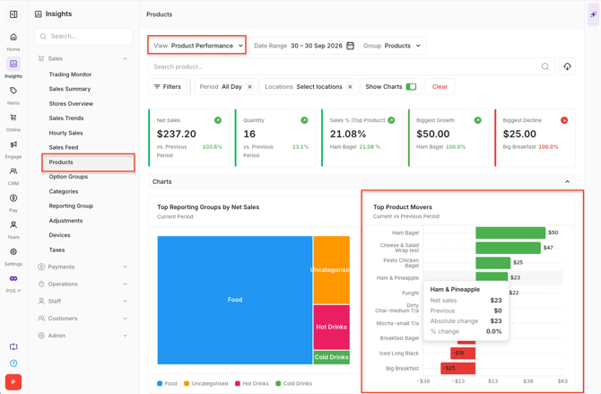
KPI cards:
-
The KPI cards provide a summary of Product performance:
- Net Sales: Net Sales generated by Products for the selected period.
- Units Sold: Number of Product units sold.
- Sales % (Top Product): Sales contribution from the highest-performing Product.
- Biggest Growth: Product with the largest increase compared with the comparison period.
- Biggest Decline: Product with the largest decrease compared with the comparison period.
-
The cards display the current value and percentage change against the comparison period.
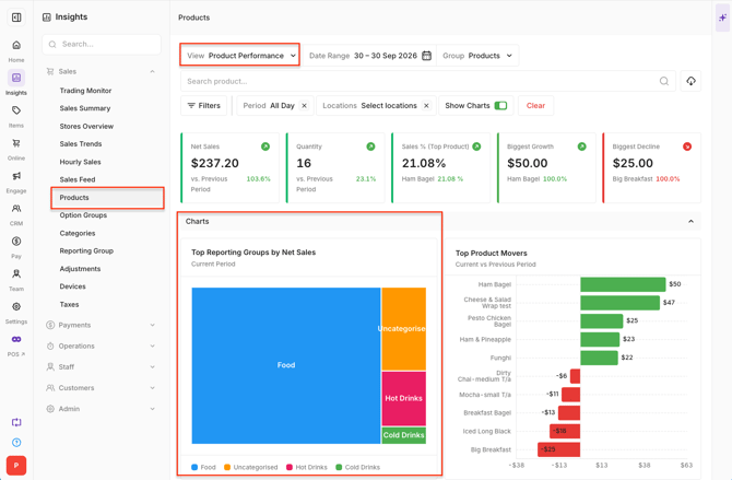
Top Reporting Groups:
-
The nested graph displays the top five Reporting Groups by Net Sales. The size of each section represents its contribution to Net Sales.
-
When more than five Reporting Groups are included, the remaining groups are combined into Other.
-
When five or fewer Reporting Groups are included, each group is displayed individually.
Product growth and decline:
-
The mover chart compares Product Net Sales with the selected comparison period.
-
Products are displayed according to whether Net Sales increased or decreased. Hover over a Product to view:
- Product name
- Current Net Sales
- Comparison Net Sales
- Change between the two periods
Product Performance table:
-
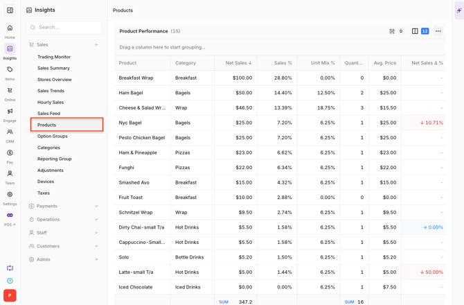
The Product Performance table provides detailed sales information for each Product, including:
- Product
- Category
- Net Sales
- Sales %
- Quantity
- Avg Price
- Net Sales Δ %
- Net Sales Δ $
- Quantity Δ %
- Order Penetration %
- Sales Count
Understand Menu Engineering
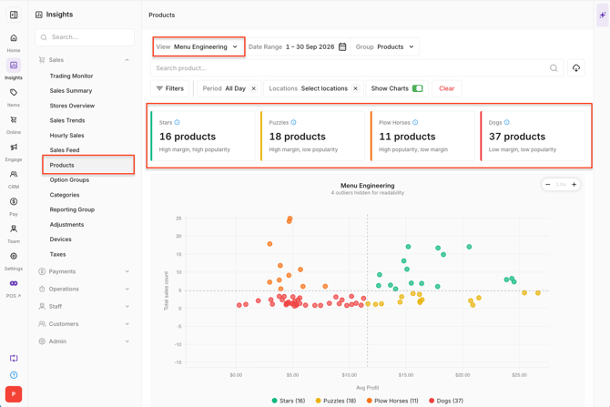
Select Menu Engineering to compare Product popularity and profitability.
Menu Engineering KPI cards:
-
The KPI cards group Products according to their performance:
- High Performers
- Margin Leaders
- Opportunity Items
- Underperformers
Menu Engineering scatter plot:
-
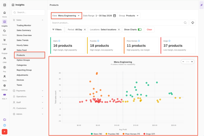
The scatter plot compares Average Profit with Sales Count. Each point represents a Product and is classified as:
- Star: High-profit, high-popularity products that sell well and generate a strong contribution margin.
- Puzzle: High-profit, low-popularity products that generate a strong contribution margin but sell less frequently.
- Plowhorse: Low-profit, high-popularity products that sell well but generate a lower contribution margin.
- Dog: Low-profit, low-popularity products that sell less frequently and generate a lower contribution margin.
-
Use the classifications together with the underlying sales and profit information when reviewing Products.
Menu Engineering table:
-
The table provides detailed Product performance and profitability information, including:
- Product
- Category
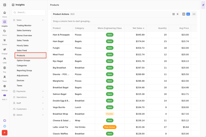
- Menu Engineering Class
- Net Sales
- Quantity
- Avg Price
- Cost
- Profit
- Gross Margin
- Sales %
- Order Penetration %
-
Use the table controls to sort, search, reorder columns, apply filters and view summaries.
Understand Modifier Analysis
Select Modifier Analysis to review the Modifiers selected with Products.
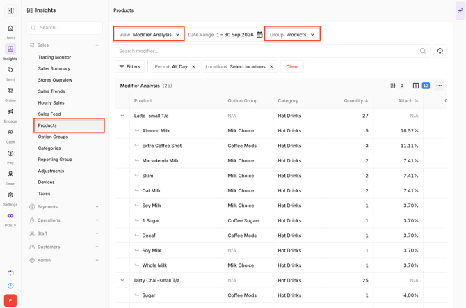
Modifiers are displayed beneath their parent Product in a hierarchical table.
Group Modifiers:
-
Modifier data can be viewed in two ways:
- Group by Product: Displays Modifiers beneath the Product they were selected with. This is the default view.
- Group by Option Group: Groups Modifiers according to their Option Group.
-
Changing the grouping updates the report without changing the selected date range or Location filters.
Understand Attach %;
Attach % shows how frequently a Modifier is selected relative to the quantity of its parent item.
-
It is calculated as:
-
Modifier Quantity ÷ Item Quantity × 100
-
For example, if a Product is sold 100 times and a particular Modifier is selected 25 times, the Modifier has an Attach % of 25%.
-
Attach % updates based on the selected filters and can be used with both grouping options.
-
Note: Attach % applies to Modifier rows only and is not displayed for parent Product rows.