
See what's really driving your menu with three focused views — Product Performance, Menu Engineering, and Modifier Analysis. Quickly spot what to promote, fix, or reconsider, without digging through spreadsheets.
Product Report
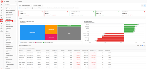
Step 1 — Open the Product Report
Back of House › Insights › Product Report
This is where the view selector and all three reporting views live.
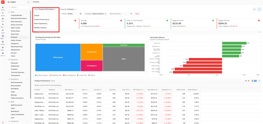
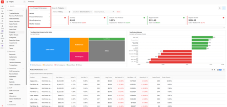
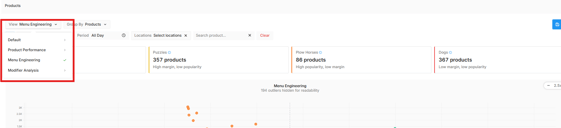
Step 2 — Switch views using the view selector
Use the view selector to switch between Default, Product Performance, Menu Engineering, and Modifier Analysis. The selected view is visually highlighted and report content updates dynamically.
Step 3 — Read the Product Performance KPI cards
Review Net Sales, Units Sold, Sales % (Top Product), Biggest Growth, and Biggest Decline. Each card shows the current value and percentage change versus your comparison period.

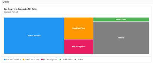
Step 4 — See top contributors in the treemap
The treemap shows your Top 5 reporting groups by Net Sales, sized proportionally by value. Groups beyond the top 5 are combined into "Other."
Other Category: if there are more than 5, the remainder will be bundled to Other.
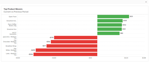
Step 5 — Track growth and decline in the mover chart
This chart shows Net Sales change versus your comparison period — bars pointing one way show growth, the other way show decline. Hover any bar for the product name, current and comparison Net Sales, and the exact change.
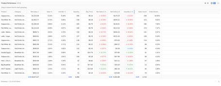
Step 6 — Explore the Product Performance table
The detailed table includes Product, Category, Net Sales, Sales %, Quantity, Avg Price, Net Sales Δ %, Net Sales Δ $, Quantity Δ %, Order Penetration %, and Sales Count.
Important: Comparing periods of 30 days or more? Growth/decline figures can look misleading
Menu Engineering
Step 7 — Switch to Menu Engineering
Step 8 — Read the Menu Engineering KPI cards
Review High Performers (Stars), Margin Leaders, Opportunity Items (Puzzles), and Underperformers (Dogs).

Step 9 — Understand your menu with the scatter plot
The scatter plot plots average profit against sales count. Each point is a menu item, colour-coded as a Star, Puzzle, Plowhorse, or Dog.
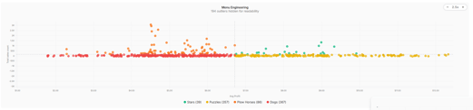 Consider actions — promote, boost visibility, adjust price/cost, or reconsider — rather than the labels themselves.
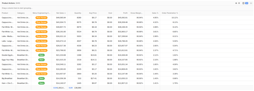
Step 10 — Explore the Engineering table
Includes Product, Category, Menu Engineering Class, Net Sales, Quantity, Avg Price, Cost, Profit, Gross Margin, Sales %, and Order Penetration %. You can sort, search, reorder columns, filter, and view summaries.
Modifier Analysis
Step 11 — Switch to Modifier Analysis
Modifiers display underneath their parent product in a hierarchical table.
Step 12 — Group modifiers by Product or Option Group
Default grouping is "Group by Product." Switch to "Group by Option Group" to view modifiers by option group instead. The view updates dynamically.
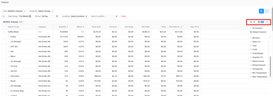
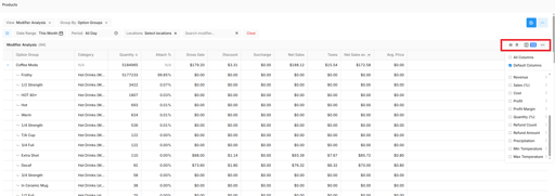
Step 13 — Customise your columns
Add or remove columns to show exactly the data you need.
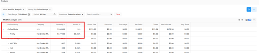
Step 14 — Read Attach %
Attach % = (Modifier Quantity ÷ Item Quantity) × 100. It updates with your filters and works under both grouping options.
Attach % only applies to modifier rows, not the parent product row.
Frequently Asked Questions
Why does "Other" show up in my treemap?
If you have more than five reporting groups, the smallest ones are combined into "Other" to keep the chart easy to read. Five or fewer groups? You'll see them all individually.
What's the difference between Stars and Puzzles?
Stars are high profit and high popularity — keep promoting them. Puzzles are high profit but low popularity — they need more visibility, not a price cut.
Why can't I see Attach % on a product row?
Attach % only applies to modifiers, not products. Check the modifier row beneath the product to see this figure.
Can I compare performance across stores?
Yes. Your date range and store filters stay applied when you switch between Product Performance, Menu Engineering, and Modifier Analysis.
Do my filters carry over between views?
Yes, switching views keeps your date range and store selections in place.